
SEO Strategy
When an Etsy shop looks busy but the visuals still confuse buyers
Sep
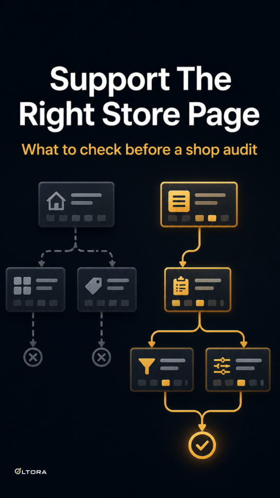
When an Etsy shop is getting attention but not enough confident clicks, the problem is often not a missing product idea. It is a visual mismatch. The shop may have solid listings, yet the photos, banners, and category presentation do not help a buyer understand what belongs together or what to trust first. That is the kind of problem a structured review can surface before you spend time rewriting everything at random.
Etsy Shop Audit + SEO Action Plan is built for sellers who need clearer direction across SEO, listing observations, pricing notes, and visual issues. The useful part is not a list of vague improvements. It is the way the findings are arranged so you can decide what deserves attention first.
When the shop image works against the offer
A buyer does not read an Etsy shop the way the seller does. The seller knows the range, the product logic, and the intended audience. The buyer sees a thumbnail, a shop banner, a title, and maybe one or two listings before deciding whether to keep going. If those pieces are not pulling in the same direction, the shop can feel active and still feel uncertain.
That uncertainty shows up in a few practical ways:
- A banner introduces the shop in broad terms, while the listings look like a different type of offer.
- Listing photos are clean on their own, but they do not signal the difference between one product type and another.
- Similar products do not share enough visual structure, so the shop feels scattered instead of organized.
- The overall presentation makes a buyer work too hard to understand the range.
None of that means the shop is broken. It means the visual system is not doing enough of the early explanation a buyer needs.
What to check before you change the shop
If you are trying to decide whether your shop needs a full reset or only targeted edits, start with the parts buyers see first. The goal is not to decorate the shop more heavily. The goal is to reduce interpretation.
1. The first image should answer a simple question
The opening image for a listing should make the product legible at a glance. If a buyer has to guess what the item is, the image is carrying too little information. If the image feels overloaded, it can create the same problem from the other side.
2. The shop-wide look should not hide product differences
Consistency is useful, but only when it helps a buyer understand the catalog. If every listing looks similar even though the products serve different needs, the page becomes harder to scan. Visual sameness can flatten the distinctions that actually matter.
3. The presentation should match the shop’s traffic reality
When traffic is weak or unclear, you do not need a cosmetic refresh that creates more guessing. You need a way to see whether the shop’s current visuals are helping buyers move from interest to understanding. That is where a review that includes image clarity feedback becomes more useful than a broad redesign plan.
Why a structured audit helps more than scattered edits
Most sellers can tell when something feels off. The harder part is separating the layers. Is the issue SEO? Is it the way listings are presented? Is pricing position making the shop feel less settled? Is the visual story too vague?
The value of an audit is that it groups those questions into a practical sequence. Oltora’s service focuses on practical SEO findings, listing observations, pricing notes, and image clarity feedback, then turns that into priority fixes and an SEO action plan. That gives you something more useful than a long list of loose observations.
For an existing shop, that matters because not every visual issue deserves the same response. A seller with a small catalog may only need clearer listing images and a tighter shop introduction. A larger shop may need a more careful review of how category groupings, repeated layouts, and product distinctions are being communicated. The size and complexity of the shop can change the scope of the review, which is why a bigger shop may need a custom quote.
When the problem is clarity, not effort
Many Etsy sellers keep adding products or adjusting titles when the real issue is that the shop still reads as unclear. Buyers rarely say that directly. They just hesitate. They may browse, then leave. They may click a listing, then go back. They may see quality in the products but not enough order in the way the shop presents them.
That is the point where a shop audit becomes a better use of time than another round of guessing. It helps you see whether the problem is the way the shop looks, the way the listings are framed, or the way the overall direction is being communicated.
If the answer is visual clarity, the next step is usually not a full rebrand. It is a more disciplined set of edits: clearer opening images, a more coherent shop presentation, and a review of where the shop introduces itself too vaguely.
What a useful next step looks like
A useful next step should do two things at once. It should tell you what is likely confusing buyers, and it should keep you from changing the wrong layer first. That is why a shop review with SEO findings, listing notes, pricing observations, and image feedback can be more helpful than a generic checklist.
If your shop feels busy but the message is still fuzzy, start by looking at the visuals as communication, not decoration. Once you know what a buyer can and cannot understand quickly, the rest of the shop becomes much easier to improve.