
SEO Strategy
How to adapt Etsy listings for digital products
Aug
When the file is fine but the listing feels thin
Digital product sellers often run into the same problem: the product itself is complete, but the listing does not help the buyer decide quickly. A template, workbook, planner, or printable can be useful and still feel easy to overlook if the page does not explain what makes it worth choosing.
That is where competitor analysis becomes practical. The goal is not to copy a winning shop or to rewrite your listing around someone else’s wording. The useful job is simpler: look for the market signals that repeat, then use them to shape your own listing with more clarity.
If you are building an original listing and want a structured way to turn market patterns into direction, Oltora’s Etsy Competitor Research & Original Listing Blueprint is built for that step. It turns visible competitor patterns into title ideas, 13 Etsy tags, description direction, pricing direction, and product-angle guidance for digital or physical products.
What to study in digital product competitors
For digital products, the most useful competitor review is not a broad scroll through search results. It is a focused look at how other sellers answer the buyer’s first questions. In practice, that means checking a small set of pages and noticing which details appear again and again.
- How the product is named in the title
- Which words appear often enough to suggest buyer language
- How quickly the listing explains what the buyer receives
- Whether the listing emphasizes use case, format, or outcome first
- How the price feels relative to similar products in the niche
Those patterns matter because digital buyers are usually comparing speed and clarity as much as features. They want to know what the file does, how they will use it, and whether the product fits the specific need they already have in mind.
A competitor shop can help you see where that explanation usually happens. Some listings lead with the format. Others lead with the use case. Others are more effective because they separate the main benefit from the technical detail. Once you notice the pattern, you can decide what your own page should prove first.
Why digital products need a different kind of listing decision
A physical product often benefits from sensory detail: size, material, finish, or how it looks in use. Digital products do not have that kind of shelf presence. The buyer is purchasing something they cannot hold, so the listing has to carry more of the work.
That shifts the question from “How do I describe it?” to “What does the buyer need to understand before clicking away?”
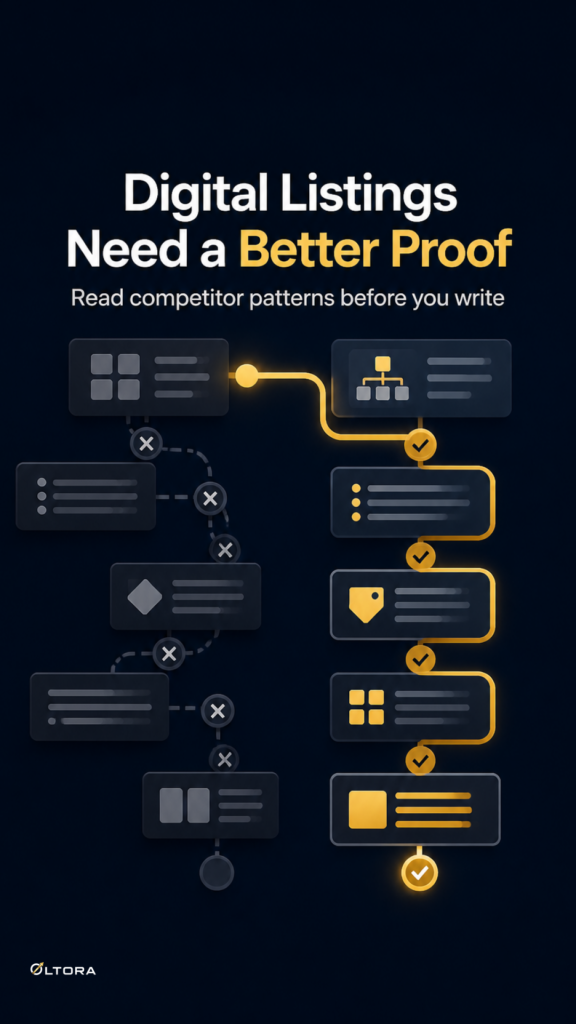
For many digital listings, the best answer is a short chain of decisions:
- What problem does this file help solve?
- Who is it for?
- What is included?
- How should the buyer picture using it?
Competitor research helps because it shows which of those questions the market tends to answer first. If strong listings in your niche all open with the same kind of buyer promise, that is a clue. If the most convincing listings use a different product angle entirely, that is a stronger clue still.
How competitor patterns become an original listing plan
Useful competitor analysis does not end with notes. It ends with a decision about your own page.
For a digital product, that decision usually affects four parts of the listing:
1. Title structure
The title should reflect the words buyers actually use, but it should still read like your product. If competitor titles repeat the same nouns or benefit phrases, you can use that repetition as a signal without reproducing their exact language.
2. Tag direction
Tags work best when they match the way shoppers search for the item. A competitor review can show whether the niche leans toward product type, use case, audience, or format. That is more useful than guessing at broad keywords.
3. Description order
Many digital listings bury the real selling point too far down the page. A cleaner structure usually starts with the buyer problem, then explains the product, then adds the technical details. If the market shows a different order that works better in your niche, the structure should follow the buyer’s likely reading pattern.
4. Image guidance
For digital products, image direction often matters more than sellers expect. Since the item is not physical, the visuals have to show outcome, format, or context. A blueprint can help here by suggesting image prompt direction for digital products, while physical products may need hero, close-up, scale, reference, or lifestyle positioning instead.
Volume matters: choose enough examples to see the pattern
One competitor is a sample. A small group is a pattern.
That difference matters because digital product niches can look more varied than they really are. A single strong listing may use a title style that would not make sense across the category. A few listings, though, can reveal the common shape of the market: how long titles run, which words repeat, whether the category leans toward practical language or more aspirational framing, and where pricing tends to cluster.
That is the point where research becomes usable. You are not asking, “What did this one shop do?” You are asking, “What is the market teaching me about how this product type is understood?”
If you want that process turned into a cleaner deliverable instead of scattered notes, the original listing blueprint is designed for that handoff. It gives you original direction rather than a copied example, which keeps the work practical for your own shop.
When the right next step is strategy, not rewriting
Many sellers start by rewriting text because that feels productive. Sometimes it is. But with digital products, the deeper issue is often the strategy behind the page. If you do not know which pattern your listing should follow, every rewrite just creates a different version of the same uncertainty.
That is why competitor research can be the better first step. It helps you decide what your listing needs to communicate before you spend time polishing the wording. You see whether the market is teaching a title shape, a pricing range, an image approach, or a stronger way to frame the product angle.
Once that decision is clear, the actual writing gets easier. The listing stops feeling like a guess and starts to feel like a response to the niche.
For sellers working with digital products, that clarity is often the difference between a listing that looks filled out and one that feels ready to be understood.