
SEO Strategy
How to test a Buy Now label before you switch the flow
Sep
When the button is fast but the wording feels uncertain
A Buy Now button can shorten the path to checkout, but the label still has to do a quiet job: it must make the next step obvious without making the product page feel like a different store. That is where many owners slow down. They know they want fewer clicks, yet they are not sure whether the new wording will fit the brand voice, the product type, or the language their shoppers already trust.
If you are considering Oltora Buy Now for WooCommerce, the readiness question is not only whether the button can send shoppers straight to checkout. It is whether the label you choose will still make sense once it sits beside the rest of the page. A good direct-checkout flow should feel like a cleaner version of the store you already have, not a separate experience bolted on top.
Start by deciding what the label must communicate
Before you change the text, decide what the shopper should understand in one glance. The inventory gives straightforward label examples: Buy Now, Get Now, Purchase Now, and Order Now. It also allows localized wording such as Acquista ora, Compra subito, Jetzt kaufen, and Acheter maintenant. Those examples are useful because they all do the same basic work: they signal an immediate purchase action.
That is the first test. If the label does not make the next step obvious, the shortcut loses its purpose. Shoppers should not have to decode the button. They should be able to read it and understand that they are moving forward, not opening a new process or entering a separate system.
Use the label to match the store voice, not to decorate the page
A practical store usually benefits from practical wording. A more promotional brand may prefer a warmer or more assertive label. The point is consistency. If your product pages are plain and direct, a plain label such as Buy Now usually fits better than something that sounds catchy but vague. If your store already speaks in another language, or serves more than one market, use a label that feels natural in each version instead of forcing one phrase everywhere.
That matters because the label is part of trust. A shopper who is ready to buy does not want to stop and wonder whether the button means the same thing in every product type or language variant. The wording should help them move, not ask them to think harder.
Check whether the button still fits the product type
A label that works on a simple product can feel incomplete on a variable product if the shopper still has to make a choice first. The inventory is clear on this point: variable products need required options selected before purchase can continue. Buy Now cannot skip that step. If no valid variation has been identified, the flow should not behave as if the product is ready.
This is where readiness planning becomes practical. Ask two questions before you switch the label:
- Will this product be bought immediately, or does it still require a variation decision?
- Does the label make sense once the shopper has finished selecting the required options?
If the answer to the second question is no, the text may need to stay more neutral until the product is actually ready to purchase. A short label is still best, but it should not suggest that the item can move ahead before WooCommerce has accepted the selection.
Keep styling quiet unless the page needs more guidance
The plugin is designed to inherit your theme styling by default, which is helpful when the store already has a clear visual system. That means the label choice can stay central while the button itself remains part of the page rather than a separate design element. If you do want more control, advanced styling lets you set different states for ready, disabled, and pressed buttons.
That is useful in a readiness review because visual clarity and label clarity should support each other. A disabled state can help the shopper understand that the product still needs another step, while a ready state can reinforce that the purchase can continue. If you do not need that extra layer, there is no reason to turn the button into a major redesign task.
Confirm the flow behind the label before you rely on it
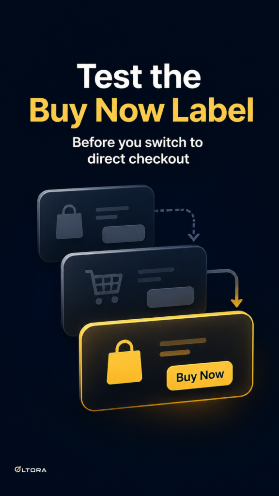
The real value of a direct-checkout button is the reduced distance between product page and checkout. The standard route often looks like Product → Add to Cart → Cart → Checkout → Payment. With the Buy Now flow, the cart stop can be removed so the path becomes Product → Buy Now → Checkout → Payment. That is a meaningful difference only if the rest of the purchase flow stays intact.
Oltora Buy Now is built to preserve WooCommerce checkout and your existing payment gateway flow. It does not replace checkout or payment processing. For store owners, that means the label question can stay focused on communication rather than infrastructure. You are not deciding whether to rebuild the purchase system. You are deciding whether the words on the button clearly reflect the faster route you want to offer.
A simple readiness check before you switch the label
If you want a quick pre-launch review, use this sequence:
- Choose the action word first: Buy Now, Get Now, Purchase Now, Order Now, or a localized equivalent.
- Check that the wording matches the store voice on the product page.
- Confirm that the label still makes sense for simple products and does not promise speed on variable products before the options are selected.
- Decide whether the default theme styling is enough or whether you need distinct ready, disabled, and pressed states.
- Keep the checkout and payment flow unchanged behind the button.
That order keeps the decision grounded. It also prevents the common mistake of treating the button text as an isolated design choice. The label is part of the buying path. When it is chosen well, shoppers understand the shortcut without noticing the machinery behind it.
If your store already has high-intent traffic, the cart page may be one step too many. A direct checkout button can remove that pause, but the wording should be tested with the same care as the flow itself. Once the label reads naturally on the page and matches the product type in front of it, the faster path feels much easier to trust.