
Custom Development
Choosing Banner Layout Alignments for WordPress Campaign Pages
Oct
Evaluating Banner Layout Alignments on Campaign Pages
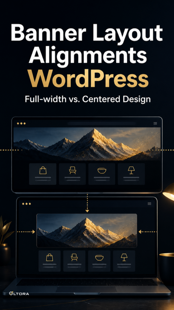
When assembling a new promotional landing page or seasonal archive, the structural decision often begins and ends with visual impact. Marketers want immediate visitor engagement, while developers look for consistent responsive scaling across screen sizes. Pushing a graphic edge-to-edge creates an immersive, high-contrast entry point that commands immediate attention. Conversely, keeping a visual element inside standard container boundaries respects existing reading columns and prevents abrupt horizontal scrolling on smaller mobile viewports. Choosing incorrectly forces an awkward compromise where headers either break grid containment or feel too boxed in to support a major announcement.
To establish a sustainable publishing routine, teams can implement Banneretor – Custom Banner Plugin for WordPress & WooCommerce directly inside their administration workflows. Having a dedicated tool allows editors to test different presentation models without rewriting theme templates or relying on external graphic editors for simple margin adjustments.
The Trade-Off Between Immersive Stretches and Contained Widths
Every layout choice carries operational and visual consequences. A full-width presentation expands across the entire browser window, utilizing high-impact photography or striking background tones to frame a top-level category or major launch. This style works exceptionally well for standalone landing pages where the primary objective is emotional resonance or immediate brand establishment. However, edge-to-edge elements demand careful padding management. If text overlays sit too close to viewport edges on tablets or mobile devices, readability drops sharply.
Contained or centered layouts take a more disciplined approach. By aligning banner boundaries with the main content container, the header behaves as a structured continuation of the page typography. This preserves natural eye movement and prevents large hero images from overpowering the introductory copy. The core tradeoff centers on visual dominance versus content continuity. Immersive banners capture attention instantly but require rigorous testing across diverse breakpoints, while contained alignments offer predictable stability at the cost of high-impact visual drama.
Verification Checklist Before Publishing Campaign Banners
Before committing a banner layout to a live environment, site administrators and content leads should review specific operational parameters to prevent common post-launch friction:
- Mobile Breakpoint Scaling: Confirm that text elements do not clip or overlap background images when viewed on narrow smartphone screens.
- Content Separation: Verify whether headline copy and descriptive paragraphs remain editable independently from background image assets, ensuring quick text updates without rebuilding entire graphic files.
- Archive Consistency: Check if the chosen layout aligns naturally with existing WooCommerce product grids or standard blog archive templates without creating jarring visual shifts.
- Asset Licensing & Maintenance: Ensure that the plugin mechanism relies on native administration controls rather than external cloud subscriptions that introduce recurring expenses.
Evaluating these criteria upfront ensures that promotional headers support visitor decision-making rather than adding unnecessary design overhead to everyday publishing workflows.